upfield
UX Research | USABILITY TESTING | USABILITY RECOMMENDATIONS
THE PROBLEM
UpField Atlanta’s mission is to provide soccer lessons to young children in the northern suburbs of Atlanta, Georgia.
As a relatively new operation with programs based in five regional cities, forty schools, and still growing, the usability of their website is a critical component to their operational success. It must clearly communicate necessary information and provide a frustration-free experience for users to efficiently navigate the multiple forms required to sign up for their programs.
Users reported frustrations with sign-up experiences, readability issues, and locating specific program information.
THE PROCESS
THE GOAL
Participants were asked to perform a series of tasks including identifying a coach, finding a league program in a specific city, and to simulate a clinic sign-up experience.
The purpose of these tasks was to help identify speculative usability issues within these specific areas and to uncover previously unknown issues.
my role
I was responsible for the completion of:
Sourcing survey participants
Sourcing usability testing participants
Conducting the survey
Facilitating the usability tests
Analyzing the data
Making informed usability recommendations
Survey & OBSERVATIONS
Securing participants that exemplified the demographic of UPfield’s known users, or potential users, of the website was a critical first step in the usability study. As the site is exclusively utilized by parents of young children in suburban areas, the participant selection process was rigorous to ensure the correct users were selected.
Once participants were selected, users were asked to complete a series of tasks. Based on an initial heuristic evaluation, there were suspected issues with locating coaching information, finding a city-specific league, and successfully completing a sign-up form. The tasks asked of the participants reflected these suspected issues and asked the users to complete them.
After each usability test had been conducted with each participant, the surveys and recordings were collected and the results were analyzed. Each participant was observed experiencing both positive and negative interactions with the website.
ISSUE 1: COLOR CONTRAST
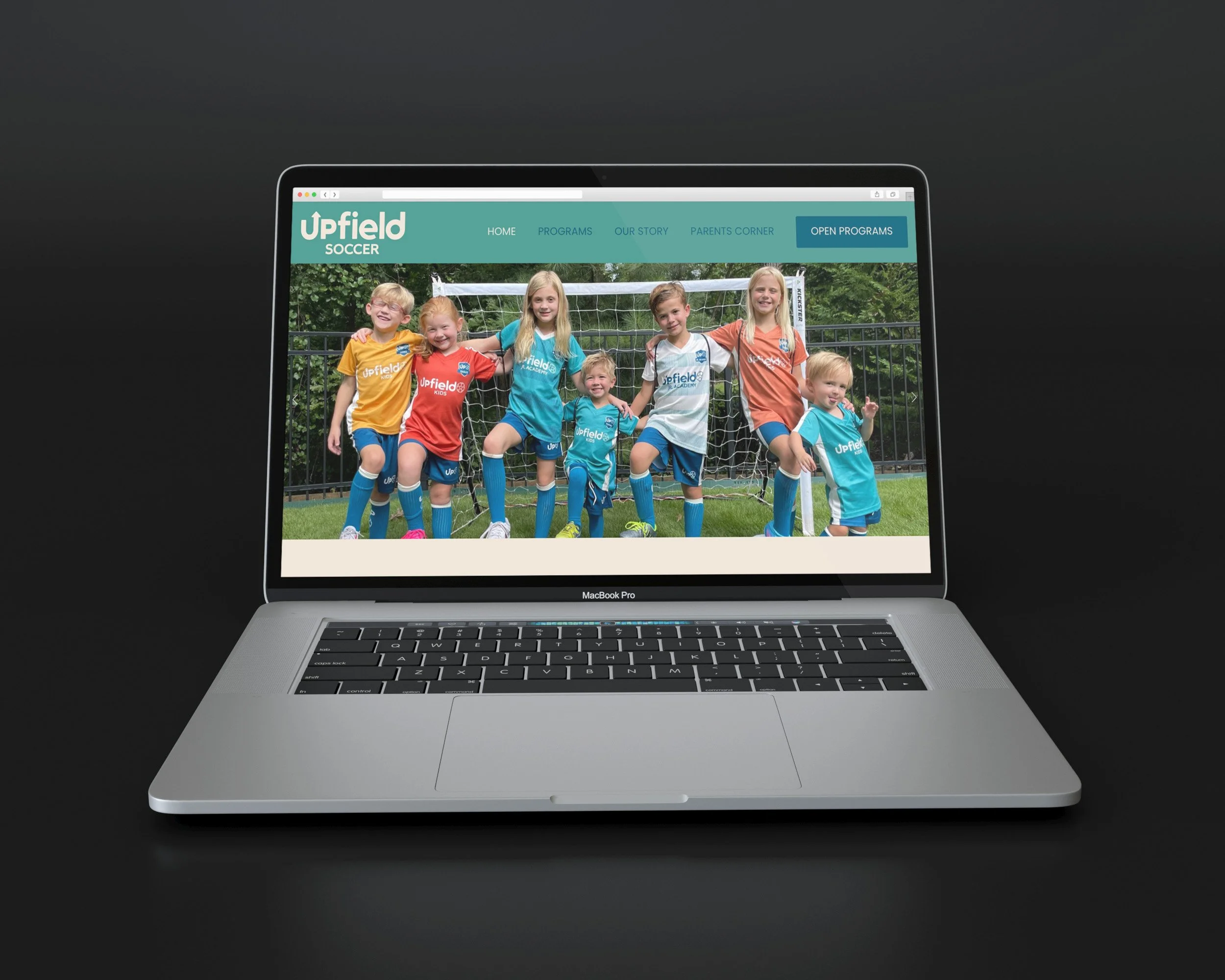
All three participants expressed concern on the header text (#00607A text on #479A90 background) and its difficulty to read.
Participant #2 commented that the lack of contrast in the colors made it extremely difficult to read as they struggled with suspected mild color-blindness. Participant #3 stated that the dark blue text “basically melted into the [blue-green] background,” making it difficult to recognize where the navigation categories were to begin the scenario/tasks being asked of them. Upon further investigation, it was discovered that nearly every instance of text on the homepage and interior pages failed ADA color compliance for contrast at all sizes.
ISSUE 2: INCOMPLETE INFORMATION
All participants were able to navigate to the ‘Team UpField’ page relatively quickly (3 seconds on average) to find information on the coaching staff, but only Participant #2 was satisfied with the content provided on the page and considered their task ‘complete.’
Both Participant #1 and #3 felt they could not consider the task complete due to the lack of information provided. Though they found information on the Director of Coaching, they were unsure if this person was a coach themselves, or just held the corporate title. Participant #3 also mentioned being concerned at the lack of images or headshots on the page and expressed a desire to see them.
ISSUE 3: INCORRECT INFORMATION
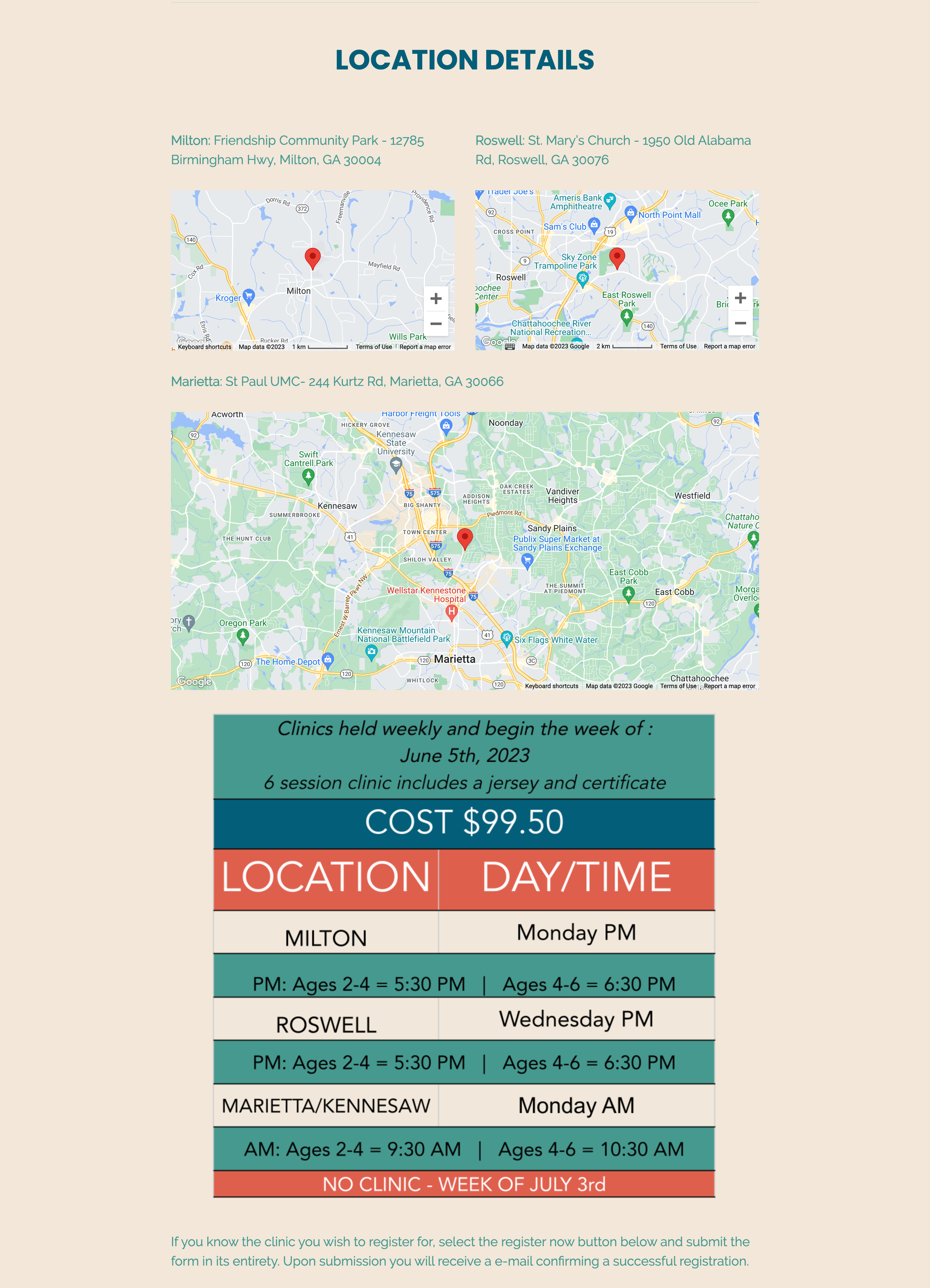
When asked to locate a League location closest to Johns Creek, GA, Participant #2 was able to complete the task in the shortest amount of time, but noted that they did not take the time to read any content and just ‘scanned until [they] found something that looked like a map.’ They admitted that while this was an effective strategy for answering the ‘ask’ of the task quickly, that they did so because they were overwhelmed by the amount of text and disorganization of the tables/charts on the page. Participant #3 expressed similar concerns, but navigated the page much slower. It took them nearly 2 minutes to determine where the classes were held and they noted being distracted by the amount of unnecessary content on the page. They also noted that the address and pin locators for the Roswell and Woodstock locations appeared to be incorrect.
ISSUE 4: BROKEN LINKS
When asked to find information on what to bring to ‘League’ practices and games, of the three participants, two were able to complete the task, and one was not.
Interestingly, all three participants took different paths to accomplish (or not accomplish) the presented task. Participant #2 implemented their self-admitted preferred strategy of scrolling until the information was found and was able to locate it fairly quickly (17 seconds). Participant #1 was able to locate the information, but managed to find and click two dead links before also scrolling. They expressed frustration in being presented with a link to find that information on the page only to be met with two dead ends. Participant #3 struggled to find the location of where this information would be housed. They visited the ‘League Programs’ page several times in hopes of finding the necessary information but was unsuccessful. Clicking on ‘Parents Corner’ had not occurred to them and they ultimately stated they would just email the coach or contact the facility for more information.
RECOMMENDATIONS
To address the usability issues uncovered during the user testing, a few recommendations for overall usability and an improved user experience have been identified.
RECOMMENDATION 1:
Revise Site Color Palette, Specifically Text Colors
Not only did participants of the study struggle with the readability of the text on the site, but nearly every text color and background combination on the website failed at all sizes for ADA color contrast.
Therefore, to not only improve the overall usability of the site, but to also make it ADA compliant, the recommendation of incrementally adjusting the brand colors should be made.
These are the color adjustment suggestions:
RECOMMENDATION 2:
Reorganize ‘Team UpField’ Page
Include local Atlanta-area based coaches on the page with brief descriptions and professional images. This would help build trust in the potential customer base and ease the minds of parents.
RECOMMENDATION 3:
Simplify ‘Leagues’ Page
Greatly simplify and combine the three graphics to include only necessary information. These should also be live text, not embedded graphics as static text images negatively impact responsive screen usage.
RECOMMENDATION 4:
Re-name ‘League Parent Corner’ Page & Fix Broken Links
The title ‘Parents Corner’ although heartwarming is confusing and would be better suited being called something more direct and helpful.
In addition to renaming the section, there should be careful consideration to testing the jump-links on each page to ensure success. Upon further investigation, there are several successful jump-links on other Parent Corner pages, but not the League page. This should be addressed immediately.
Next Steps
Looking towards the future for UPfield, the next steps would be to develop prototypes for the recommended adjustments.
Once those prototypes are finalized, it would be necessary to re-conduct the user testing to ensure the issues were not only addressed, but resolved in a way that greatly improves the user experience.
SEE MORE


