clover
UX Research | Usability Testing | Design Prototype
THE PROBLEM
Providing payment processing, inventory assistance, payroll services, and more - Clover supports thousands of small businesses in their daily operations. In order to best support those small business owners, Clover’s must continually improve the user experience of their website for future and current customers alike.
After conducting a Heuristic Evaluation, there were concerns with the usability of the website, specifically regarding the product availability, pricing, and help center.
This usability test confirmed the suspected issues.
THE SOLUTION
BEFORE: Pricing information is scattered across several internal pages requiring tedious scrolling
AFTER: A concise, usable interactive element allows users to quickly navigate products and corresponding pricing structures
THE PROCESS
THE GOAL(S)
The purpose of this academic project was to ensure small business owners could research, identify, and purchase the Clover small business solution(s) best suited to their needs with high efficiency and through a concise, well organized website.
my role
My responsibilities included sourcing survey and usability testing participants, conducting the survey and usability tests, and analyzing the data. From the data, usability recommendations were made and informed the design prototypes.
TOOLS UTILIZED
Figma
Lookback.com
Adobe InDesign
PROCESS & OBSERVATIONS
In order to aptly test and uncover potential usability issues on the Clover website, it was decided that real, or potential, small business owners would be the ideal group of users to survey.
A 17 question survey was designed to extract users demographic and psychographic information, as well as determine small business solution preferences and initial website feedback.
Eleven participants were selected to complete the survey and produced the following quantitative data:
Were current or prospective small business owners
Included male & female participants
Ranged in age from 22 to 67
Were all U.S. based
Varied in their ethnicity
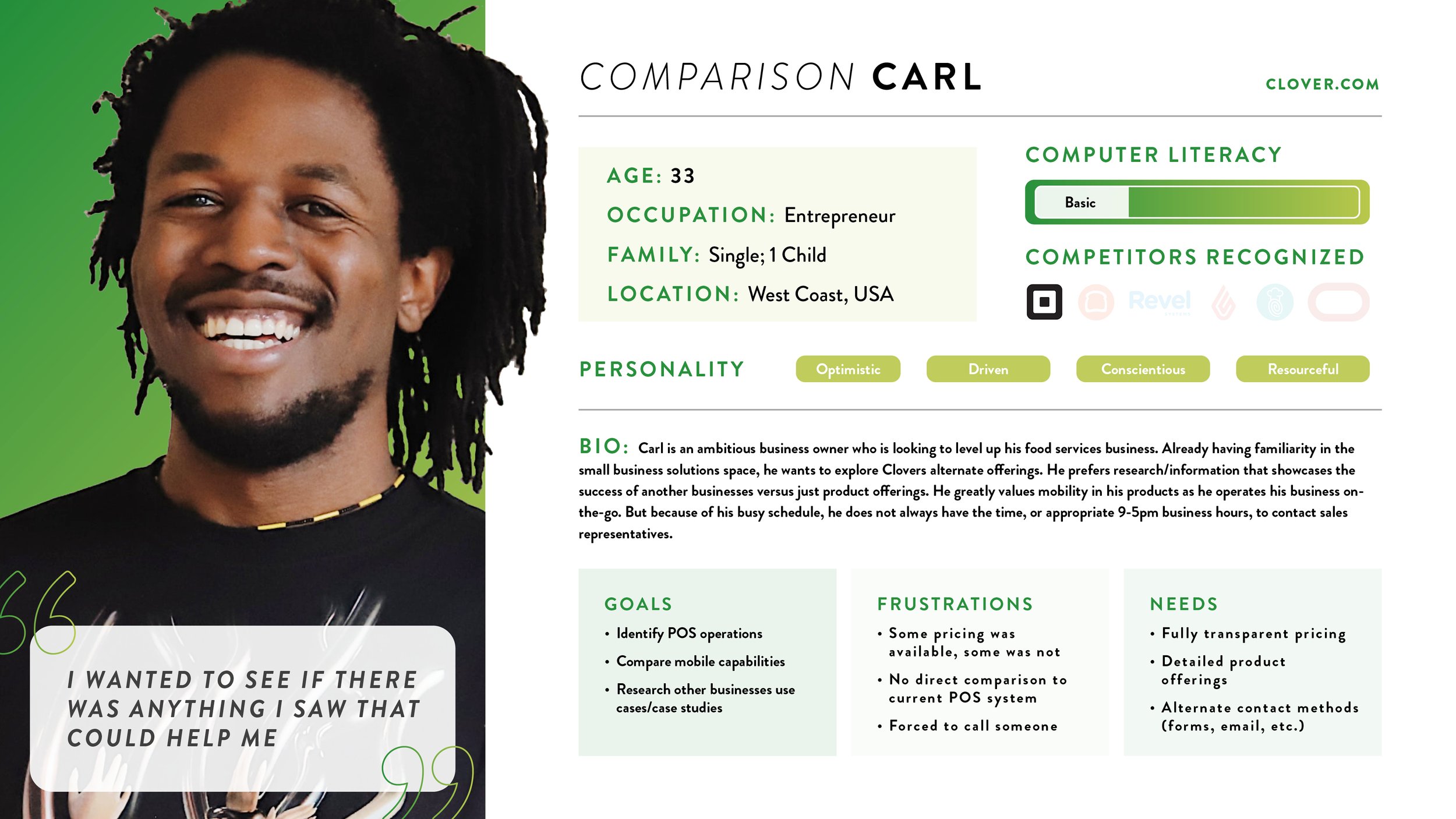
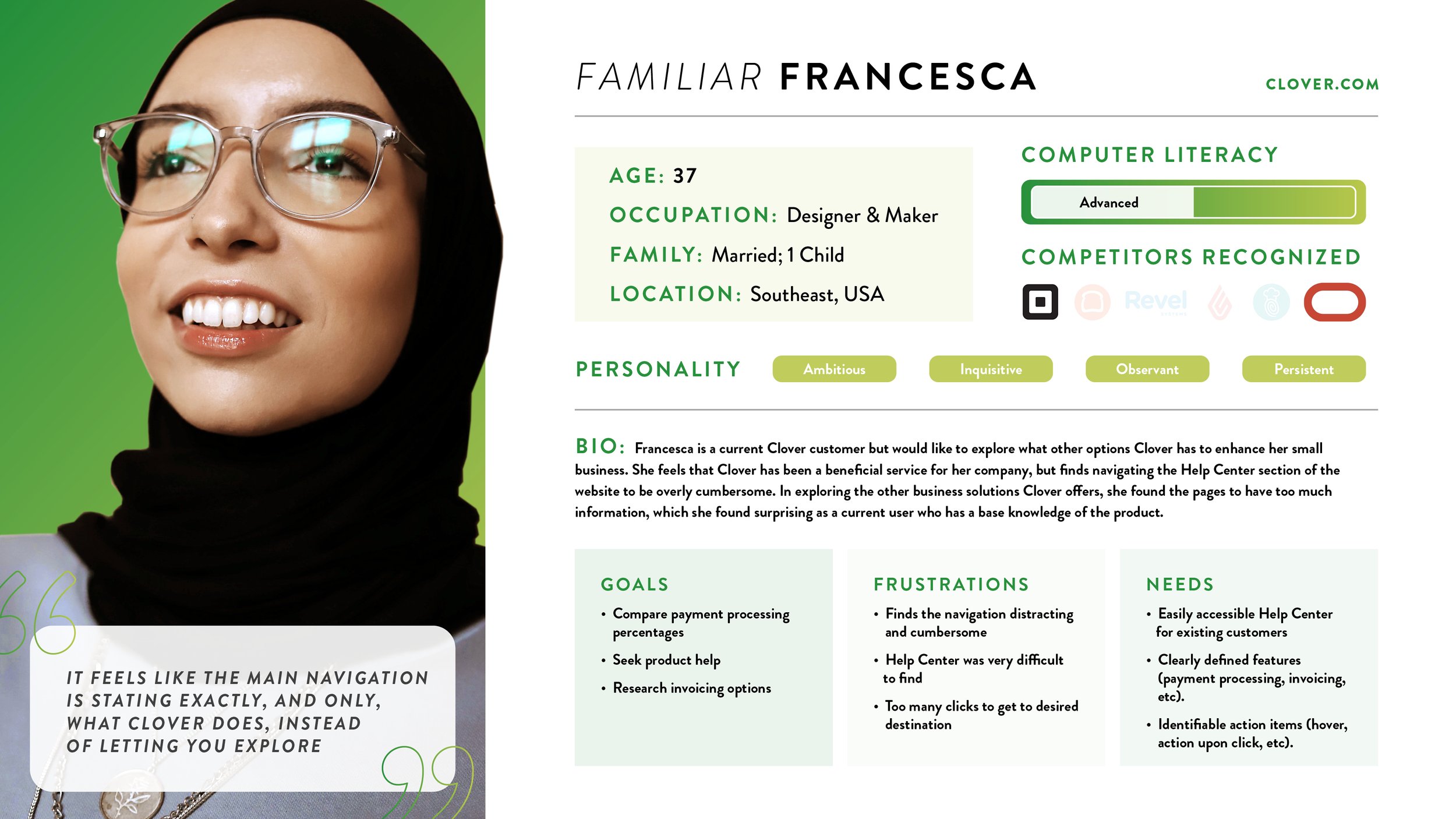
Based on this data, four personas were created to best represent the users.
Two of those personas are featured here in this case study.


A full usability test was then conducted using five small business owners. The goal was similar to the survey: to uncover potential usability issues. The users were asked to perform a series of tasks divided by specific scenarios. The tasks and scenarios for this usability test were heavily informed by the qualitative data collected in the initial user research and personas.
The usability test yielded the following major results:
Two participants were not able to locate purchasable product
All users had to visit multiple pages for product information
Two users were not able to simulate a purchase experience
FINAL PROTOTYPES
PROTOTYPE 1
Issue 1: Several pages must be visited before identifying more than 1 product
Recommendations: Implement a product comparison tool; Add the product comparison tool in navigation to replace current ‘Pricing’ page
Issue 2 & 3: Information is found on products but is inconsistent on if pricing is featured. Participants were not able to locate purchasable product.
Recommendations: Implement a product comparison tool featuring pricing; Move the ‘Pricing’ page link to the left side of the navigation
The prototype directly addresses the need for a product pricing comparison tool. A simple drop down menu allows users to select the product in which they would like to see pricing for. On the pricing module, there is a toggle to allow users to view two different payment options - monthly or in full. There is also an opportunity for users to view the full product page for each product as well as immediately add it to their cart for purchase.
PROTOTYPE 2
Issue 4: Users reported being unsure if the Help Center was for current customers, prospective customers, or both
Recommendations: Include conspicuous labels and/or pathways for current and prospective users to navigate to their respective Help section
Issue 5: Only 1 of 5 participants were able to successfully navigate back to the main Clover site after visiting the Help Center
Recommendations: Link the Clover logo in the ‘Help Center’ header to best follow common web design conventions
Issue 6: Recorded upwards of 126 seconds to locate Help Center
Recommendations: Move ‘Help Center’ to primary navigation; Keep ‘Help Center’ in footer to allow greater chances of user recognition
The prototype addresses all three issues raised within the Help Center and navigating to the Help Center. Though a simple solution in terms of development, this will allow users to not only get to their desired location with greater efficiency, but could allow both parties to feel that they are recognized and taken care of on a more personal level.
Lessons Learned & Next Steps
Looking towards the future for Clover.com, prototype testing would be the logical next step in improving the efficiency and usability of the site.
Testing on current Clover users could also be a previously unexplored method of uncovering usability issues as all of the participants tested were small business owners and prospective users, not current.
Despite being an academic assignment, real changes were actioned on the live Clover website that reflect the issues that were uncovered in the usability test I conducted. Clover was not notified of my findings, but it is fascinating to see the parallels made in the usability discoveries.
The page links were rearranged and “Help Center” was added to the primary navigation as can be seen below.
NAVIGATION 2022: When testing for the project was conducted, the navigation appeared as above. “Help Center” was not present and '“Pricing” was buried in the right side navigation
NAVIGATION 2023: If users visit the present day Clover.com, the “Pricing” has been moved to a more easily locatable position and “Help Center” has been added to the navigation
SEE MORE


